Thursday, September 6, 2007

I'm kind of obsessed with camera obscura. Any band that has a Nordic couple dancing amidst a wall of IKEA lamps is a band I must enjoy. (Their lyrics aren't too bad, either. "We'll find a cathedral city / So you can be handsome / I'll be pretty." Also, they use an organ in a number of their songs.) I want them to come back to San Francisco. 

I can't really update this blog with any updates on the New West situation. I'm not sketching enough or thinking about it enough to make a cool and/or interesting revival of the magazine... for now.

I did do some work on a spec cover for an excellent book. My new goal is to get a small portfolio of spec covers to see if I can solicit some freelance work for small presses in the Bay Area. (Well, my real goal is to get a somewhat interesting job that allows me the time to pursue these small things — I'm slowly inching toward resolution on that goal.)

I'm going to try to intersperse this blog with some tidbits from life and to update more frequently. Also, I'll attempt to tell Rice folks about this blog, in case people want to see what's been going on in my "zany" life.

Doesn't this photo of Steve Jobs look kind of Blue Man Group-ish? (Let's set aside the "iPod touch" logo, of course.) I'm half tempted to go to an Apple Store and buy a 4 gig iPhone. $300! More storage space than my current iPod... though not by much. So I give in to rationality and wait until a firm job offer comes... or until a 3G iPhone comes out?

So I've discovered these things in the past week: 1) This Korean bar in Santa Clara is quite good. 2) I love Andrew Bujalski. I guess that's kind of a given — I'm an aimless, quasi-creative 20-something with a penchant for beer and ridiculous conversations. 3) BART from Millbrae to anywhere in the East Bay is ridiculous. 4) 311 operators are not only amazing with providing directions via MUNI, but also with many ridiculous tasks.

And with that, my first non-designy post is concluded. (Endnote: I do like that Leslie Feist now has her own iPod commercial. Admittedly, the video is kind of cool.)

Sunday, August 26, 2007

Cartier Watches and Abortions

This is a brief aside from my work on New West, mainly because I'm having a bit of trouble working with the flag. 

I am extremely interested in how organizations within the pro-life movement use graphic design and visual communication. In particular, I believe that the movement appears to use graphic design as a means to convey a particular moral lifestyle, a moral viewpoint rather than a particular rational argument. (The visual trope that appears most often is the image of the baby; rarely is there ever an image of an embryo or a moral argument of why a pro-life person believes that life begins at birth.)

This seems to be in line with contemporary advertising; advertising increasingly attempts to create an internalized image, a lifestyle rather than an argument (eg, "Buy Method because your lifestyle is chic and green," rather than "Buy Method because we list all of the chemicals and ingredients on our bottle and you can rest assured that there are no unnatural chemical substances." [which, by the way, Method does not list their ingredients -- look to Seventh Generation for that one])

An increasingly popular argument among pro-life activists is that legalized abortion engenders an amoral lifestyle and ultimately, an amoral society. Again, this seems extremely contemporary -- that an entire lifestyle can wrap around one object or idea. A watch is promoted as being part of a life filled with luxury; an abortion is promoted as being part of a life filled with sin.

Anyway, this is sort of a brief outline of a series I would love to do later on pro-life organizations and their use of graphic design. There's such a wide gamut of pro-life organizations. On one end, there's the Consistent Life movement, which has earned quite a (negative) reputation amongst the hardcore pro-lifers. On the other end, there's Operation Rescue, which we all know and love from various media reports suggesting some sort of link between them and violent attacks on abortion clinics.

Wednesday, August 22, 2007

Revival!!! (Or, How I Started Blogging Again Because of Some Weirdly Named Magazine.)

So to mark the revival of this blog, (and my creative instincts) I'm starting out on a week-long project outlining how a particular magazine could be revived. I know, this ain't no conceptual project. It's certainly no challenge to society. I just need a nice fun thing to work on and to put into my portfolio.


Brief:

This magazine is New West Magazine, a regional magazine that was published from 1976 to 1981. The impetus for its publication came from the publisher of New York Magazine, Clay Felker. His concept was simple: to bring a magazine of the same quality of New York to the West Coast. (Mind you, this is the heyday of New York: a combination of a service magazine, a culture magazine and a listings magazine, with long-form journalism as its centerpiece.)

Within its five years of publication, New West launched a number of careers, and several notable editors passed through its doors. William Broyles (of Rice! and of Texas Monthly) edited the magazine after its purchase by Texas Monthly in 1980 and left in 1982.

I read through a number of issues and what struck me was how the departure of New West (and its successor, California) left a fairly giant hole for good long-form journalism in California. Los Angeles is an excellent regional publication with a stable of excellent writers, but it is largely concerned with the Southland. San Francisco has been on steady decline since its purchase by Modern Luxury; the Kamala Harris [the DA of San Francisco] piece last month is the latest example of how low journalistic standards have gotten at SF. (In case you're wondering, the piece was largely laudatory, even going as far as using photographs from her official campaign photographer in lieu of more words that could have actually yielded an analysis of her tenure in office. Brief aside over.) Let's not even talk about the pure luxury plays in San Francisco and Los Angeles. The new California (by the Berkeley Alumni Association) is sort of nice, but its an alumni service magazine first and foremost.

What's more, I think there's room for an intelligent magazine that covers all of California, not just individual regions. Much hay has been made of the Northern California / Southern California split, but at heart, our state is so inextricably linked that a single contemporary narrative can be woven from California. My good friends from Sunnyvale go to school in Los Angeles. I eat strawberries grown in the Central Valley. Another friend has worked at the two branches of Yahoo in Santa Monica and Sunnyvale.

Since New York has been doing very well as of late (a good, stable set of writers) and its creative direction has been top notch thanks to Luke Hayman, I think it's time that some patron should revive New West.


Introduction: Why New West?

The name is such a "love it or hate it" name. It's certainly not bland, or forgettable like California. It may strike some as being too close to "New York," and not harkening to our region whatsoever. But, I think that there's something to be said about the quirkiness of its name. I remember when I first heard about New West in Armistead Maupin's Tales of the City. The name stood out to me enough to where I googled it and became fascinated by its story. It's been long enough that it's kind of retro for one group of people, but not retro at all for another group. (A whole generation has certainly never heard of the magazine. For what it's worth, my baby boomer mom's only heard of California.)


Visual History (1):

In general, there were two flags used on the cover of New West. One is much, much better than the other. Here they are:

The sharp, Ed Benguiat-style flag from 1976 - 1979. It's nice, a little deriviative, but a very nice flag. Not at all like...


Mmm, not-so-good. The subhead is probably somewhat necessary, given that New West is a bit vague as to what region of the US its covering. However, still not-so-good.

Like our good friend New York, I think it might be good to sharpen up the Ed Benguiat flag, freshen it up and make it more modern and relevant. This shall come tomorrow.

Tuesday, June 19, 2007

CONCEPT: 1000 Words


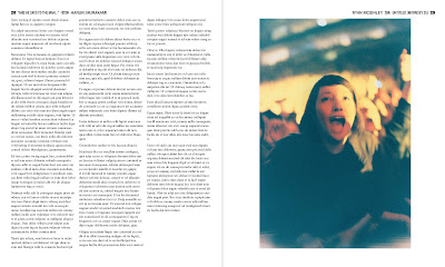
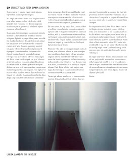
Here's a magazine concept. I would love to link original art with original prose in some sort of publication. 1000 Words would be a cross between a photography mag and a lit mag. Each page can either be 1000 words of prose (well, i suppose 1000 words of poetry would be OK too) or a photograph/artwork.


No exceptions.

Well, that's a lie. I envision a split page, where the top is 500 words and the bottom is 500 words. Or the top is 500 words and the bottom is half of a photo. The crop is arbitrary — it crops off the top half of a photo if it resides on the bottom, the bottom half if it resides on the top. (I'm envisioning something like Nikki S. Lee's "Parts" series, though done en masse.)


But doesn't that privilege a writer, who gets to shape his or her writing for for the 500 word limit? I think not. Photographers would know ahead of time that their work would be a half-photo, so they'd use the crop to enhance their work. Plus, the cut can be interesting and artistic. It adds a bit of randomness into the photo.

The page could further be split into 250 words / 1/4 photo, but I don't have a mockup of that. 
Every page must reside within a pre-determined margin. 

Since we know that each page is one (or two) new photos or stories, all information can be put into the page folios. If it's a two-fer, there's enough space in the margins on the bottom to give the same information. I haven't figured out the four-fer.

Covers and ads must also fit these requirements.

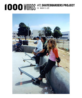
Here are a couple of cover ideas:


And a mockup of a Prada ad (with a photo of the Prada Marfa project for kicks).
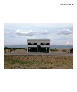
Oh, and it would to be a bigger mag so that words are still legible — 12" by 10".

(Yes, it would be extremely hard to fund something like this.)

Friday, June 1, 2007

RETHINKING: AT&T Logo


The new AT&T logo is a bit farcical. It pretends to be the old AT&T but lightly freshened up, a sort of AT&T 2.0. (It even looks like a Web 2.0 property.) I think it's trying to convey the message that the New AT&T is a little more friendly, less Helvetica and corporate than before. Let's be frank here. That's pure marketing bullshit. Why can't the new AT&T logo communicate more? Why can't it actually say something about the company, besides empty rhetoric? Again, in this blog, we tend to conceptualize designs that are all communication (in my own terms, we tend toward the extrema of communicative design or non-communicative design).

Here are a couple of AT&T logos I'm proposing:

Concept 1: Brand Names

This takes on the idea that each part of AT&T acquired by AT&T has brand equity and worth. Aside from concerns about retaining brand equity, I think there's something that rings true about a logo that says, "Well, hey, we're a company built on mergers and acquisitions." Hell, it kind of says that we own up to it and we're damn proud of it: "We ARE mergers and acquisitions." It's also designed to echo the old AT&T logo, giving it a little twist in the process.


(1) Two-Color Logotype


(2) Alt Two-Color Logotype (blocks match up with the length of each name)


(3) Reverse Two-Color Logotype


Concept 2: Brand Colors

This is a concept based on the EU barcode designed by AMO/Rem Koolhaas. Each color represents each company owned by AT&T. Each is given a length based on the amount of the company that comprises the value of AT&T, including Cingular and the old AT&T Mobility. What about values of companies merged into a company then merged again into AT&T? They get a 25% fade into the color of the new company with length based on % value of the company at the time of the merge into the company merged into AT&T (eg, Pacific Bell Mobility gets 20% of the Cingular bar with a 25% fade into the orange of the Cingular bar).

This mockup will come later.

Tuesday, May 29, 2007

CONCEPT: Automatic CD Names

My good friend Bradley M. Colquitt rejected this idea for his band's new CD, so I feel totally OK putting this concept out there.

(I'm also working a brief little paper on function and design. This idea is sort of an aside to that paper.)

It seems ridiculous for bands to have to find names for CDs and tracks. It is assumed that the meaning of the song is not dependent on the track name. Musicians shouldn't have to take on additional responsibilities beyond Additionally, it seems ridiculous for listeners to have to remember track names in addition to album names. Ridiculous.

For this band, their first CD should be named "A." Their next CD should be named "B." So on, and so forth, until the twenty-sixth album is named "Z." Then, their twenty-seventh album should be "AA."

On each CD, each track should be named numerically, with a placeholder "0" for the first nine tracks.

For example, the band's second CD would have this tracklisting:

Ellipsis. B.
01
02
03
04
05
06
07
08
09
10
11

If the band hits it big and has a huge discography, the time saved using this scheme could be enormous. We all know this scenario:

Me:
"I love Norwegian Wood. Amazing song. Sounds almost Indian, like Ravi Shankar or something."

Random person who doesn't know the Beatles very well:
"Oh. Hrm. Isn't that a Beatles song?"

Random person has absolutely NO IDEA where to find Norwegian Wood. He or she probably has no idea that its on Rubber Soul. Now say that the Beatles had used my numerical system:

Me:
"I love F02. Amazing song. Sounds almost Indian, like Ravi Shankar or something."

Random Person:
"Oh. Hrm. Isn't that a Beatles song?"

But now, Random person knows what CD the song is on, and also where exactly on the CD it is on. He doesn't have to remember that Norwegian Wood is the second track on Rubber soul. More functional information is conveyed through communication than before.

Here are a couple of quick drafts of the cover and back of the first album for a band called Ellipsis. Helvetica Neue (Neue Die Neue Haas Grotesk! A post about this to come.) is used for the both cover and back, at 36 pt for the first line, 120 for the cover's second line, and 60 for the back's second line. More to come.

Monday, May 28, 2007

Welcome to Fin de Siècle...

a conceptual graphic design weblog in the vein of BLDGBLOG or Pruned. Purely conceptual in nature, I hope to pose peculiar graphic design ideas to solve problematic things in the world. This blog will not veer totally toward the functional (as no blog in the vein of BLDGBLOG should be), but instead stretch what is normally considered design into new and exploratory realms.

In short, dreams, conjectures, speculatory ventures, "solutions," and errands into the wilderness shall be explored in this blog.

Side note: Fin de Siècle is the name of my future atelier, so please don't touch.