Tuesday, June 19, 2007

CONCEPT: 1000 Words


Here's a magazine concept. I would love to link original art with original prose in some sort of publication. 1000 Words would be a cross between a photography mag and a lit mag. Each page can either be 1000 words of prose (well, i suppose 1000 words of poetry would be OK too) or a photograph/artwork.


No exceptions.

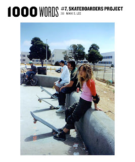
Well, that's a lie. I envision a split page, where the top is 500 words and the bottom is 500 words. Or the top is 500 words and the bottom is half of a photo. The crop is arbitrary — it crops off the top half of a photo if it resides on the bottom, the bottom half if it resides on the top. (I'm envisioning something like Nikki S. Lee's "Parts" series, though done en masse.)


But doesn't that privilege a writer, who gets to shape his or her writing for for the 500 word limit? I think not. Photographers would know ahead of time that their work would be a half-photo, so they'd use the crop to enhance their work. Plus, the cut can be interesting and artistic. It adds a bit of randomness into the photo.

The page could further be split into 250 words / 1/4 photo, but I don't have a mockup of that. 
Every page must reside within a pre-determined margin. 

Since we know that each page is one (or two) new photos or stories, all information can be put into the page folios. If it's a two-fer, there's enough space in the margins on the bottom to give the same information. I haven't figured out the four-fer.

Covers and ads must also fit these requirements.

Here are a couple of cover ideas:


And a mockup of a Prada ad (with a photo of the Prada Marfa project for kicks).

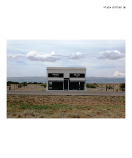
Oh, and it would to be a bigger mag so that words are still legible — 12" by 10".

(Yes, it would be extremely hard to fund something like this.)

Friday, June 1, 2007

RETHINKING: AT&T Logo


The new AT&T logo is a bit farcical. It pretends to be the old AT&T but lightly freshened up, a sort of AT&T 2.0. (It even looks like a Web 2.0 property.) I think it's trying to convey the message that the New AT&T is a little more friendly, less Helvetica and corporate than before. Let's be frank here. That's pure marketing bullshit. Why can't the new AT&T logo communicate more? Why can't it actually say something about the company, besides empty rhetoric? Again, in this blog, we tend to conceptualize designs that are all communication (in my own terms, we tend toward the extrema of communicative design or non-communicative design).

Here are a couple of AT&T logos I'm proposing:

Concept 1: Brand Names

This takes on the idea that each part of AT&T acquired by AT&T has brand equity and worth. Aside from concerns about retaining brand equity, I think there's something that rings true about a logo that says, "Well, hey, we're a company built on mergers and acquisitions." Hell, it kind of says that we own up to it and we're damn proud of it: "We ARE mergers and acquisitions." It's also designed to echo the old AT&T logo, giving it a little twist in the process.


(1) Two-Color Logotype


(2) Alt Two-Color Logotype (blocks match up with the length of each name)


(3) Reverse Two-Color Logotype


Concept 2: Brand Colors

This is a concept based on the EU barcode designed by AMO/Rem Koolhaas. Each color represents each company owned by AT&T. Each is given a length based on the amount of the company that comprises the value of AT&T, including Cingular and the old AT&T Mobility. What about values of companies merged into a company then merged again into AT&T? They get a 25% fade into the color of the new company with length based on % value of the company at the time of the merge into the company merged into AT&T (eg, Pacific Bell Mobility gets 20% of the Cingular bar with a 25% fade into the orange of the Cingular bar).

This mockup will come later.